Some of these rooms are almost unrecognizable! Here’s 23 before and after room makeover photos packed with DIY remodeling & decorating ideas.
Budget-Friendly Home Decorating Ideas And Inspiration
Hi, guys! I’ve been remodeling our home for about 10 years now. So, a lot of big changes have happened around here! And, most of those changes were money-saving DIY projects that I’ve blogged about.
Most of those DIY tutorials also include a short YouTube video to help other DIYers save money on their own home remodeling projects.
Todays post is packed full of my 23 favorite before and after room makeover photos with tons of links to the DIY projects that turned those rooms from outdated or boring to updated traditional style.
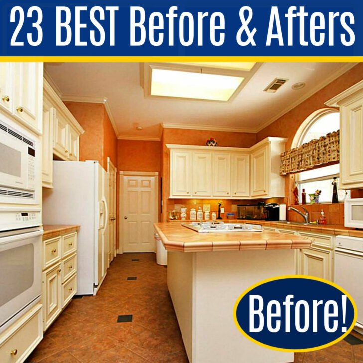
Let’s get started!
My Best Before And After Room Makeovers
Two Story Living Room Makeover (1-3)
Let’s start with my once boring Living Room. There was just a bit too much beige happening, right?!
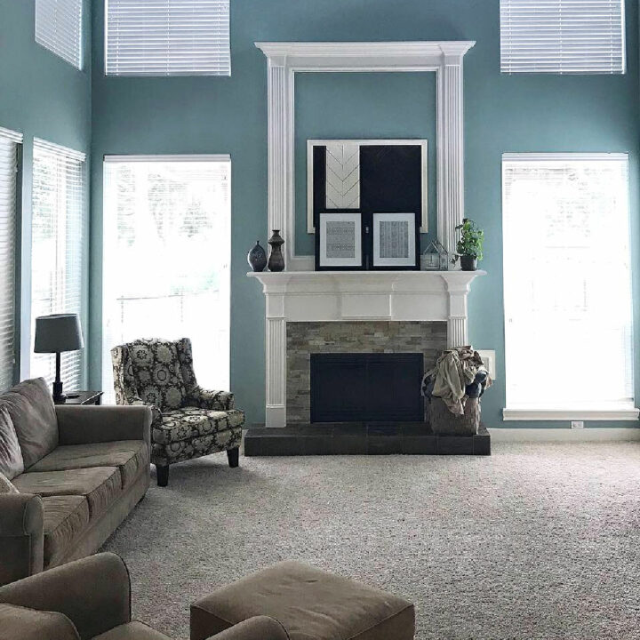
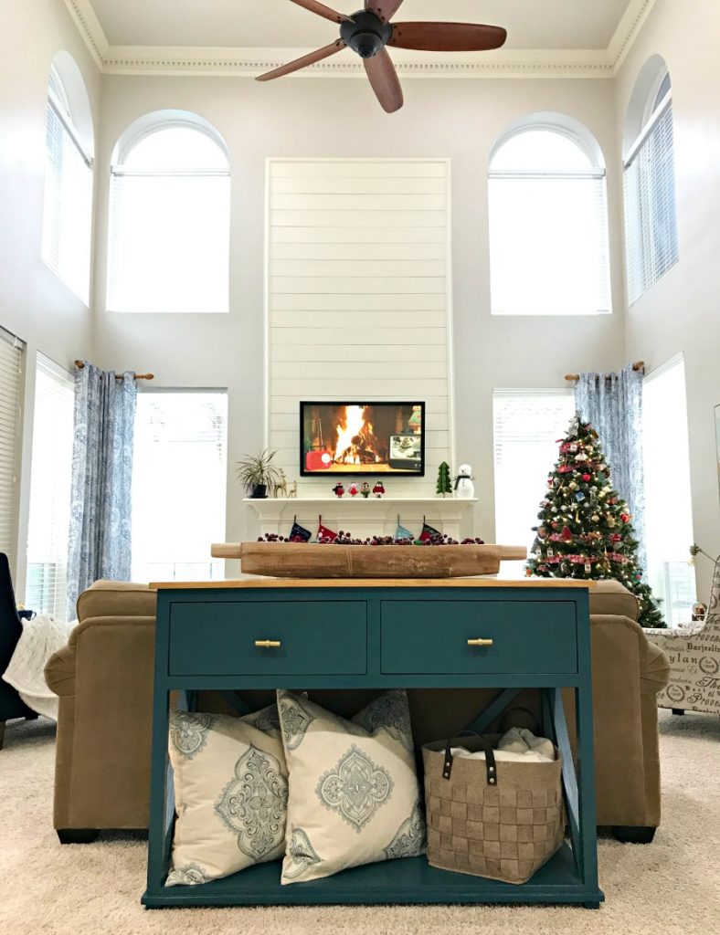
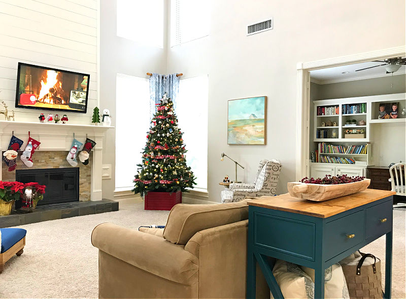
So, I lightened up the walls and added shiplap above the fireplace. Then I layered in tons of color and switched up the furniture layout.
All of these changes ended up making the room feel lighter, brighter, and BIGGER. You can find the rest of the Living Room Makeover photos here.
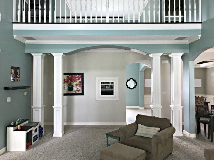
If you want some budget-friendly ways to update a Living Room, check out 14 Best Ways to Renovate A Living Room on a Budget.
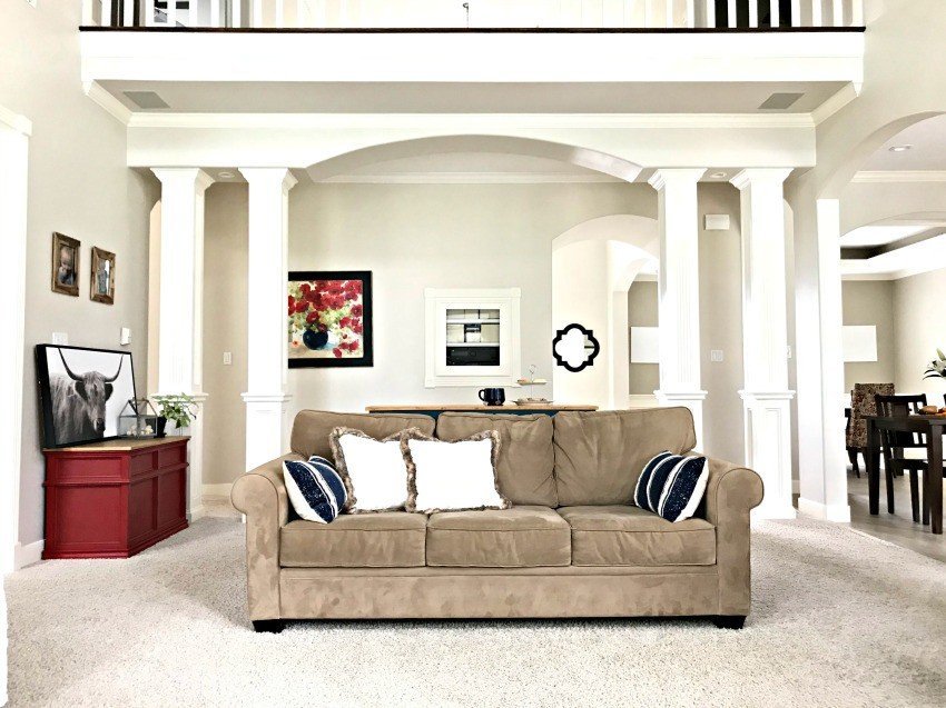
The pops of color against that light paint color is such a HUGE improvement!
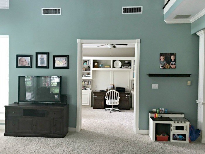
Moving the TV above the fireplace made room for 2 couches and a chair in our large Living Room. Orienting our seating towards the fireplace also meant we were finally enjoying the views in our backyard.
You might also like 16 Great Ways to Repurpose an Unused Formal Living Room, if you’re tired of looking at a Formal Living Room that sits empty all of the time.
Our 90’s Kitchen Room Remodel (4-6)
This 90’s-style kitchen was at the top of my list of room remodels, when we moved in.
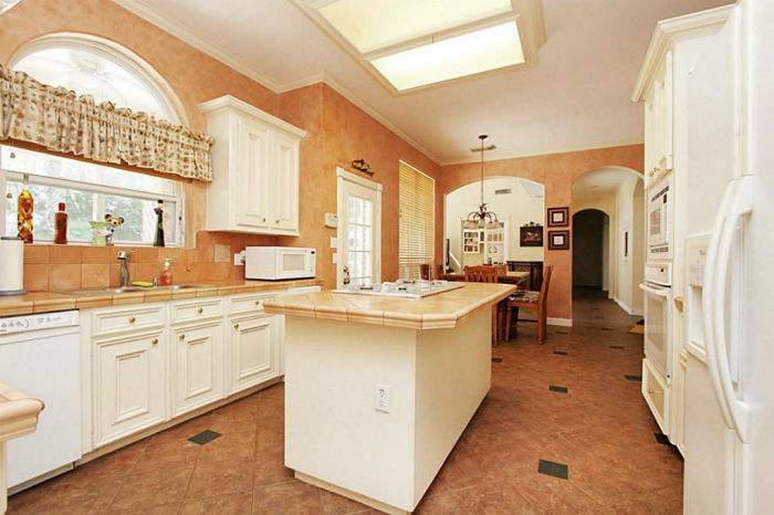
That tile counter, the poorly designed cabinet and kitchen appliance layout, and that fluorescent box light were just a few of the things I hated in this room.
We completely gutted this kitchen; installing new cabinets, new flooring, quartz counters, a larger back door, larger island, and modern appliances. I also had the light fixtures changed.
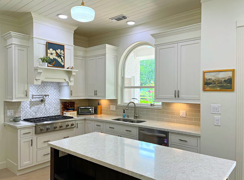
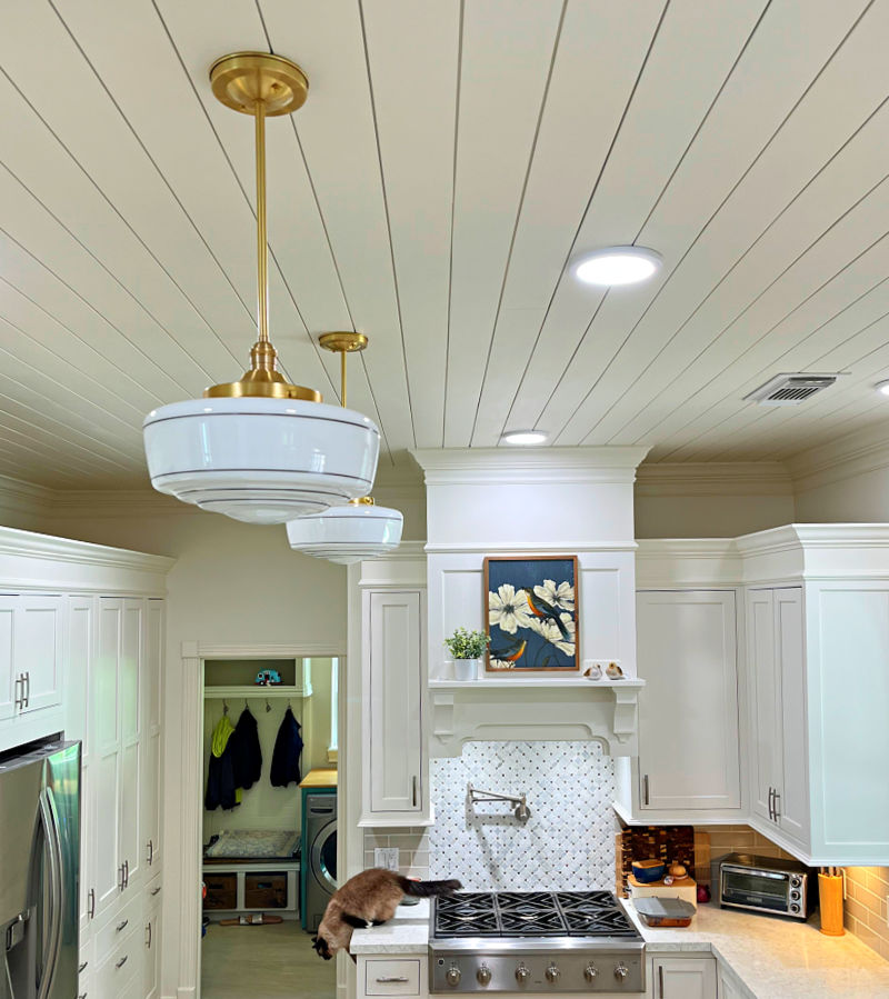
I recently installed shiplap over a textured ceiling in here and replaced that single crown molding with this DIY 2 piece crown molding.
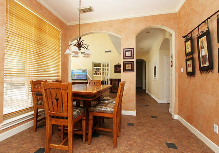
The chandelier over the breakfast table really limited where I could put our table. So, I had that light fixture removed and changed the layout to improve the flow.
Removing the blinds on the huge windows in our kitchen makes the whole room feel brighter. And, we LOVE the unobscured view of our backyard landscaping and pool.
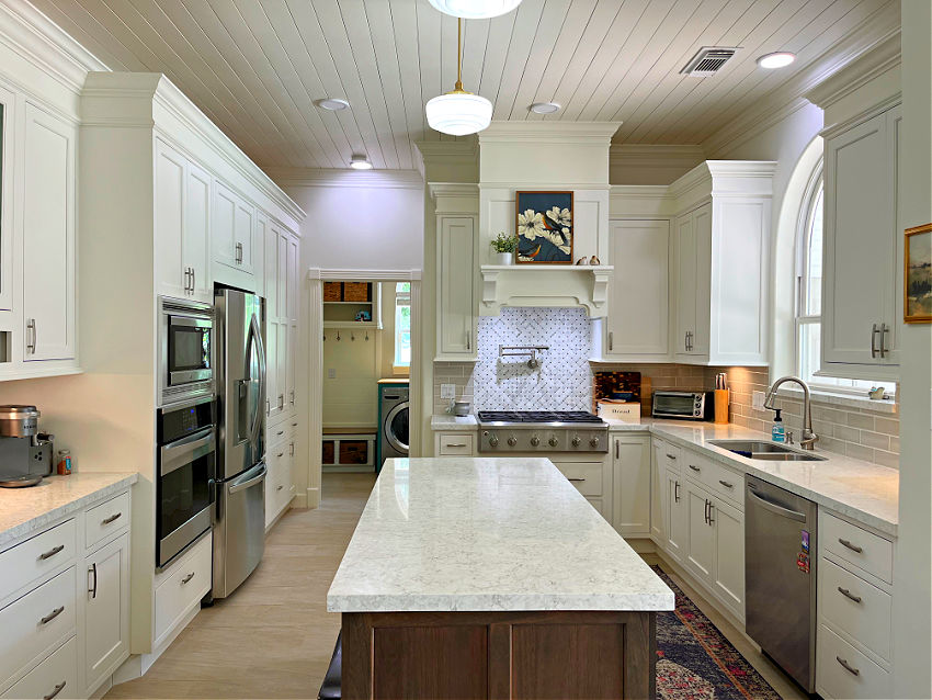
In the original kitchen layout the oven and microwave were on the outside edge of the kitchen layout. Having those deep, large appliances there made the kitchen area feel smaller and closed off.
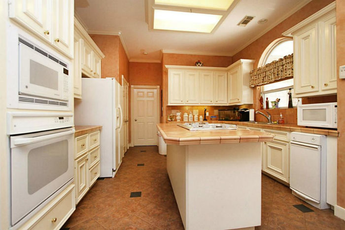
The oven and microwave were so far away from the sink and fridge. The “kitchen triangle” was blocked by the kitchen island. That made cooking in this kitchen kind of a pain.
We also removed the pantry closet on the far left, replacing it with pantry cabinets instead.
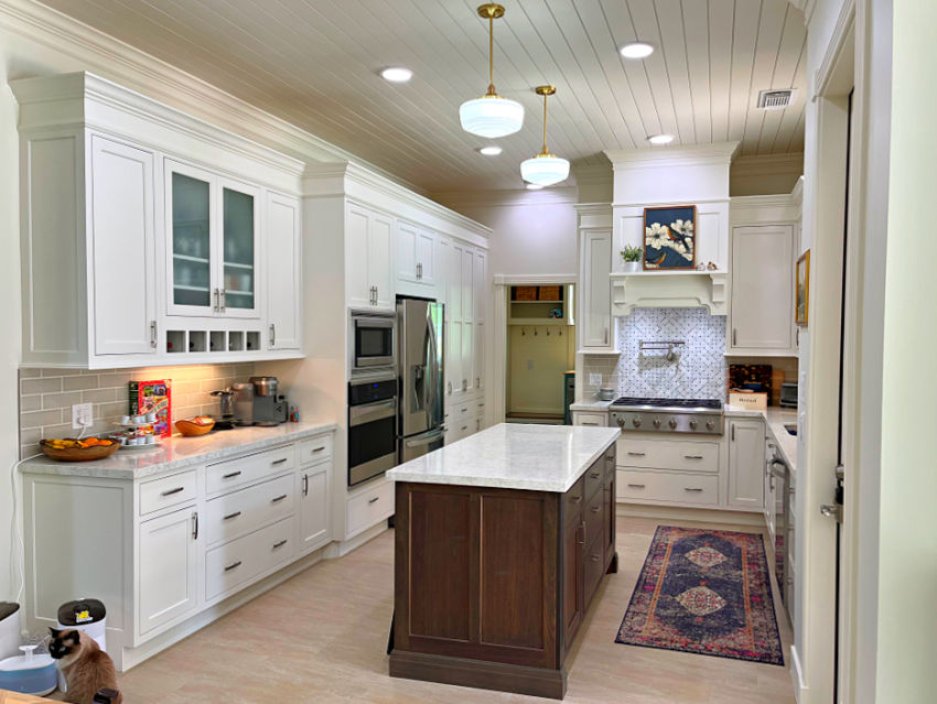
Switching everything around made room for a great beverage station on the left of the oven.
Check out the 3 Easy And Best Ways To Clean White Kitchen Cabinets – Plus, 3 To Avoid! if you want to see how I keep my cabinets clean.
Dining Room Makeover (7)
Let’s move on to this crazy 90’s Dining Room. I’m sure it was on-trend back then, but it was time for a big change in here.
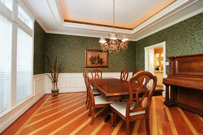
In the Dining Room, I had the same tile floor installed that I used in the kitchen. I also lightened up the walls with a neutral color.
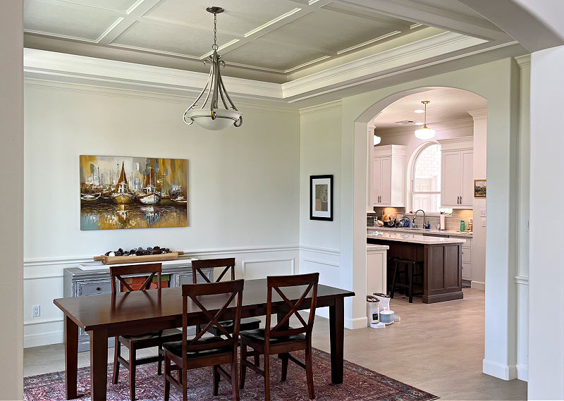
And, I also installed this Easy DIY Coffered Ceiling Idea on the ceiling in there. The Dining Room is the first room you see when you enter my home. So, I wanted a beautiful ceiling feature to add a Wow Factor.
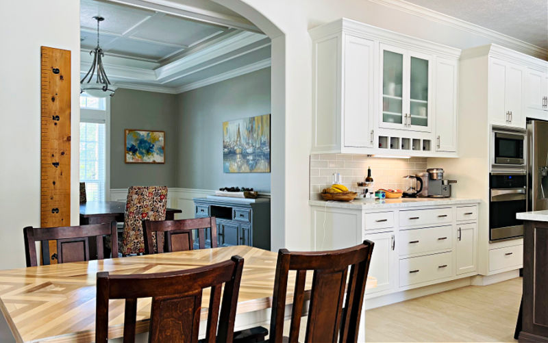
In the photo above, you can also see how I had the small door leading to the Dining Room replaced with a large arched opening. That design matches my home and makes the rooms more connected.
RECOMMENDED: 14 Best Ways To Make Your Ugly House Look Good On A Budget!
My Latest Before And After Room Makeover (8-9)
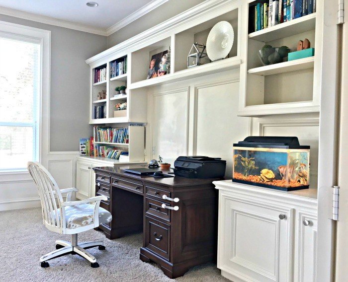
Alright, let’s move on to our home office makeover. In this room I wanted to extend those built ins to add more storage. I also really wanted those cabinets to look like built in furniture.
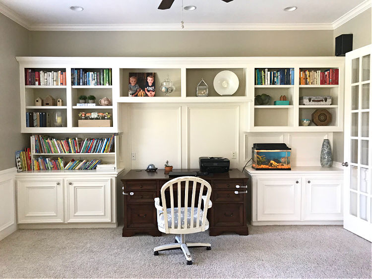
I added cabinets to the ceiling and cabinets between the uppers and lowers to turn these built ins into a full wall to wall, floor to ceiling set of built ins. Painting them a fun color was a huge improvement too.
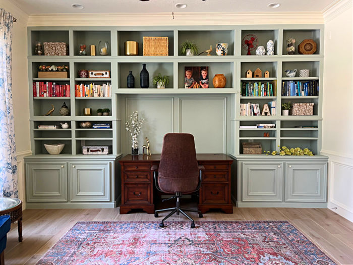
Adding more trim and molding to those built ins amped up the style. I also installed a beautiful 3 piece crown molding in this room, new tile flooring, a large area rug, and colorful curtains.
You can find that large, budget-friendly rug on Amazon. Those long, colorful curtains are also pretty cheap on Amazon too. I LOVE those curtains so much, I’m using them in my bedroom now too.
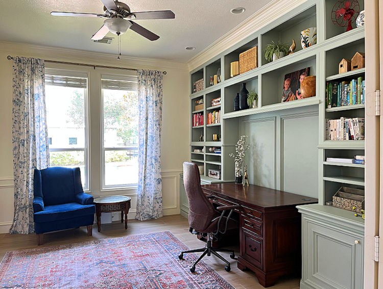
This home office is SO GOOD now, I keep the doors open when we have guests. In the past, I always tried to hide it behind the doors.
My Longest Before And After Room Makeover (10-12)
Right across the hall from our Home Office is the room that has gotten the most updating over the years. That’s because I couldn’t really figure out how to use this room that was originally a Formal Living Room.
Check out 16 Great Ways to Repurpose an Unused Formal Living Room if you have an unused room too.
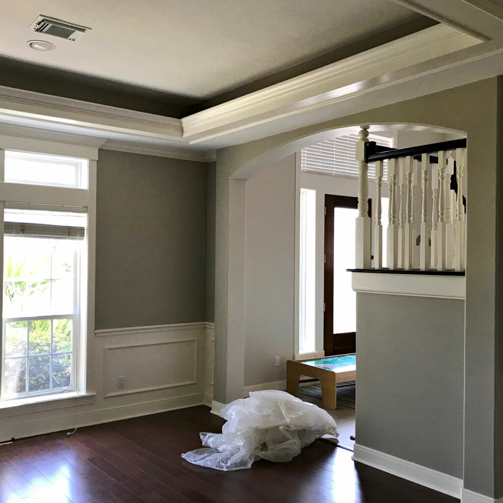
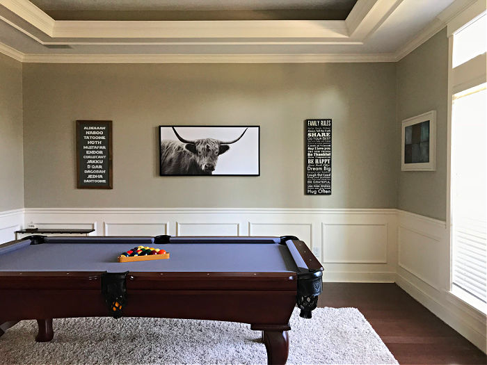
In the last 10 years, this room has been a kids play room, a pool table room, and now it’s a much needed, and used, Family Room.
Closing off the opening to the foyer created privacy and a sound-barrier. It also gave me a great place to install a full wall of built ins. That added TONS of storage for all of the toys, books, and games we have.
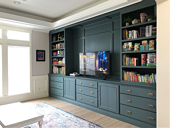
The built ins in this room got an eye-catching color too. See my tips to Paint Built In Bookshelves And Cabinets in a previous post.
Like in so many other rooms, lightening up the walls really made the whole room feel lighter and brighter.
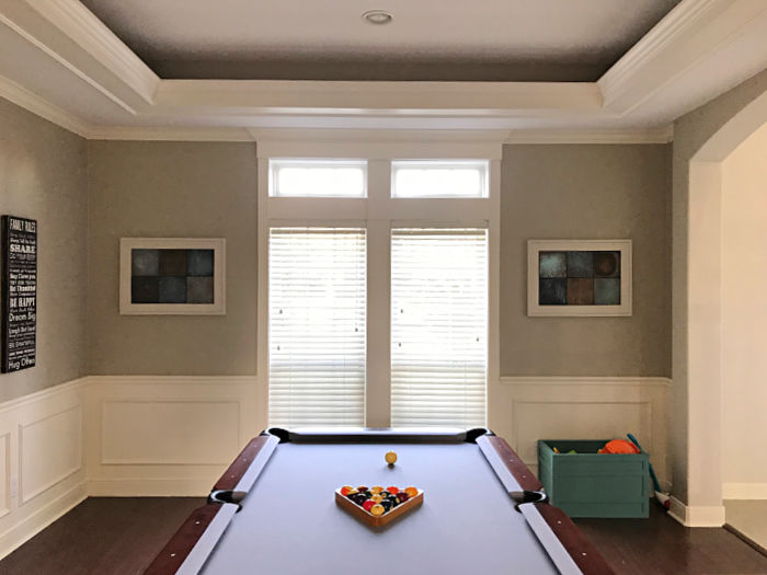
And, instead of adding on to the already nice tray ceiling, I amped the style up with Eggshell Sheen paint instead.
Check out the Best Ceiling Paint Finish: Flat vs Eggshell Sheen to see more ceilings with this sheen update.
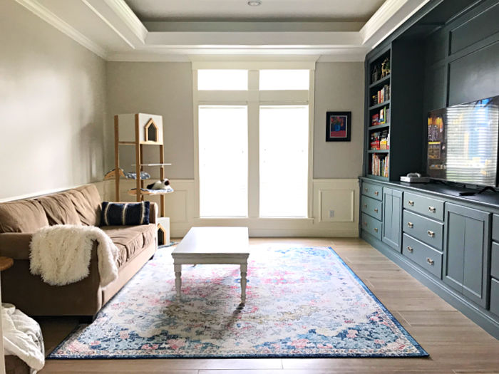
Here’s one last look at a before and after room makeover photo from this Family Room Makeover. You can see in this before photo how the room was once used as a pool table room.
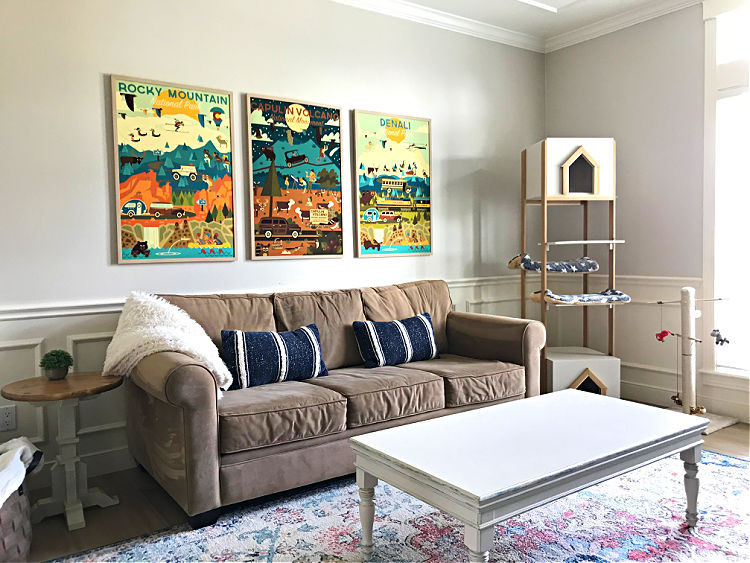
I filled up that large wall over the couch with 3 oversized travel posters. Framed poster art is a pretty cheap way to add color and art to any room.
Check out 7 Helpful Tips for Decorating a Large Wall in a Living Room for more options.
The Huge Foyer Before And After Room Makeover (13-14)
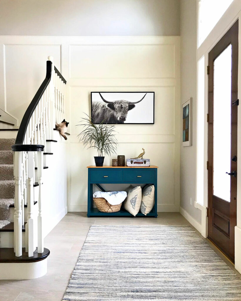
Alright, let’s move onto what the two story foyer looks like after I closed off that arched opening to the Family Room. The opening was SO BIG that there was no room for furniture in that large foyer.
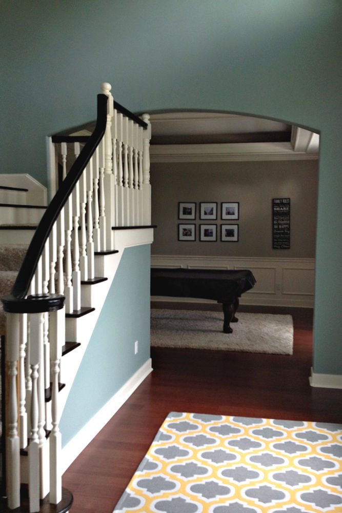
Once that opening was closed off, I installed more trim to match the original stairway trim. And, I was able to add a BIG entry table and artwork to make the foyer seem more formal and stylish.
In my opinion, going bigger than you’d think on furniture, art, and light fixture always makes rooms feel bigger. My sweet cat decided she needed to be involved in this photo shoot.
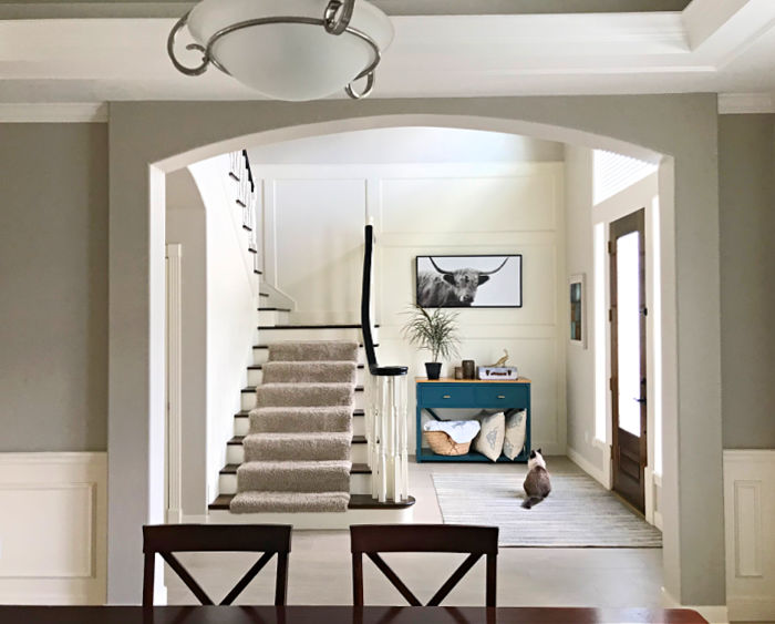
The changes I made in our Foyer also gave us a new, beautiful view from our Dining Room table.
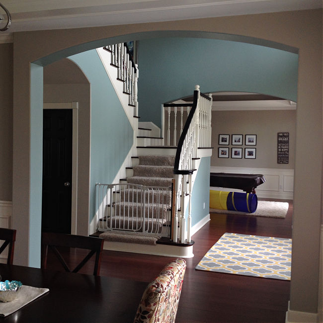
Again, lightening up the paint in these rooms was a HUGE improvement. White just makes colors POP while also making the rooms feel lighter and brighter.
Laundry Room Makeover (15-16)
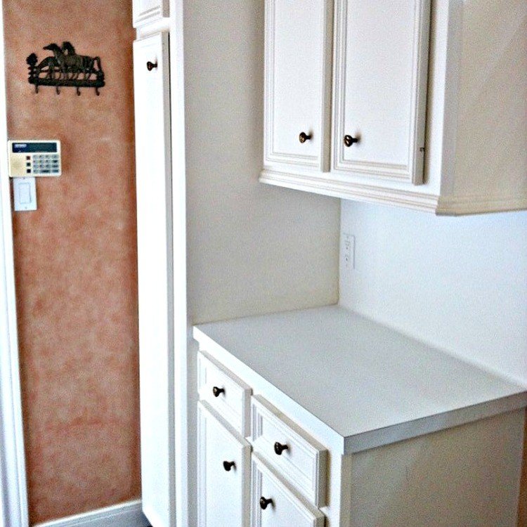
This Laundry Room was another one of the first rooms I changed. That’s because it is the main entry we use. So, I have to look at it all of the time! And, I was tired of that laminate counter and backsplash.
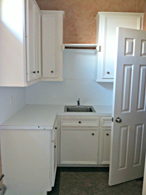
I ended up painting the cabinets, having new counters and flooring installed, adding an extra shelf, and I installed a wood paneling backsplash that looks so much better.
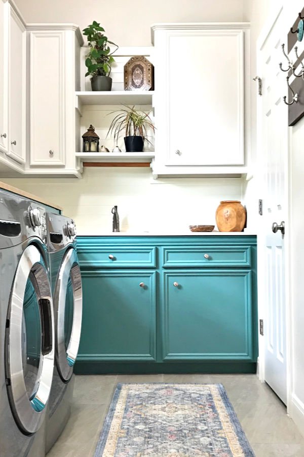
I also hated the huge gap that was behind the washer and dryer. So, I ended up building a DIY Laundry Table that goes over the washer and dryer. That worked great for hiding the gap and the machines.
And, aside from the looks of the room, we also needed coat and shoe storage. To solve that problem, I cut into the cabinets next to the garage door. I turned a base cabinet into a mudroom bench.
I also cut the bottom of the upper cabinet off to create head room for anyone sitting on the bench. Then I installed the same wood paneling I used on the backsplash to make those cabinets look like a hall tree.
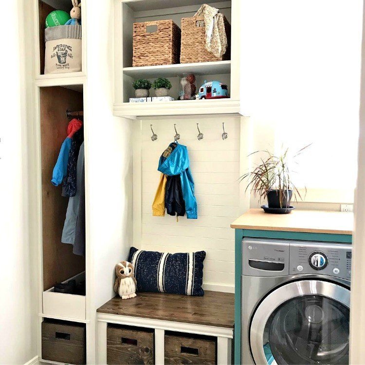
Check out the steps for those simple DIY Wood Storage Bins I made for shoe storage. Or, see the story behind how this room was featured in Better Homes and Gardens here.
Boys’ Bedroom Makeover (17-18)
Moving on, here’s a look at the bedroom our boys share. It took me a few years to figure out how to decorate their room in a way that wasn’t too boring or “out-of-the-box”.
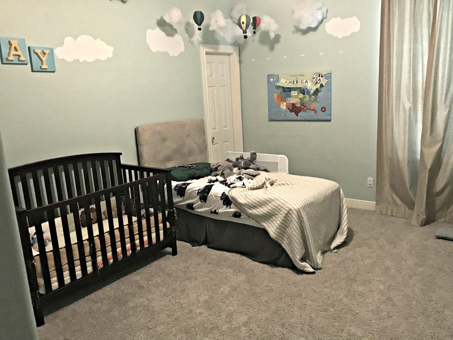
BUT, I finally figured it out! I went with a DIY Board And Batten With Lattice on the back wall. And, a Beautiful Two Piece Crown Molding around the whole room. And, once again, I went with white walls.
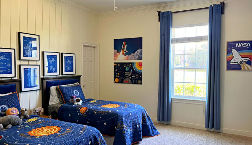
I added some fun space themed décor, new bedding, curtains, and wall art. The Star Wars Blue Prints above the beds are my favorite.
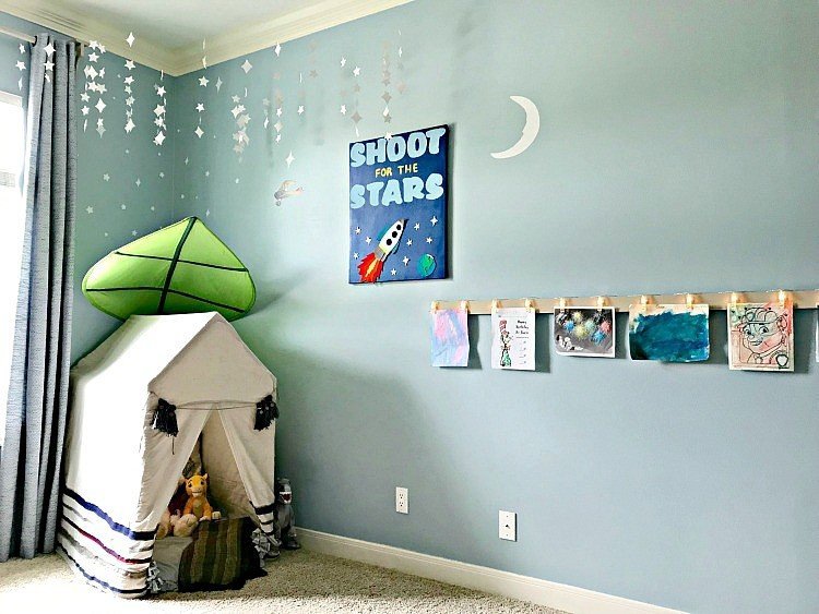
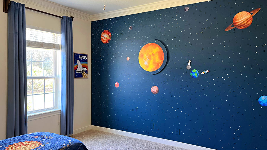
I also went for a full DIY Outer Space Bedroom Wall Idea that is basically just blue wall paint with vinyl stickers on top. Easy!
Before And After Room Makeover On Our Master Bathroom (19-20)
Now, let’s talk about our Master Bathroom. That orange and black tile was a problem to decorate around in here too. So, a few years ago, I spent a couple months on a full Master Bathroom Remodel.
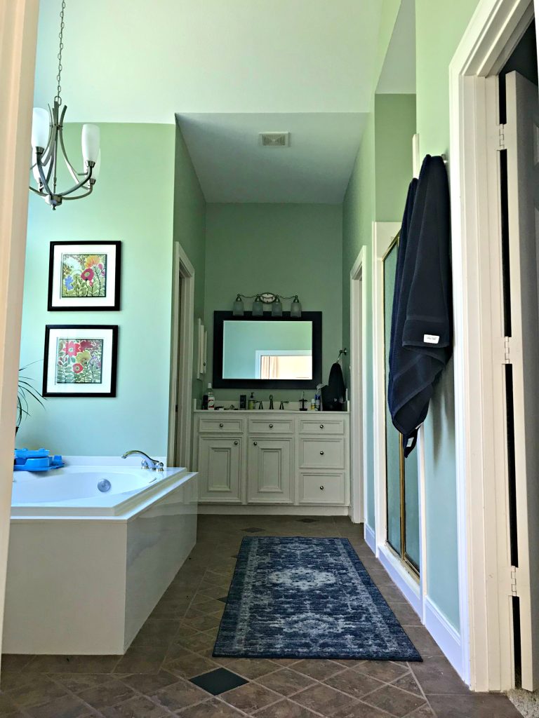
I went with a huge chandelier over the new extra big soaking tub, faux shiplap planks on the ceiling, light walls and marble tile. And, I also used a dark blue chalk paint and dark wax on the vanities.
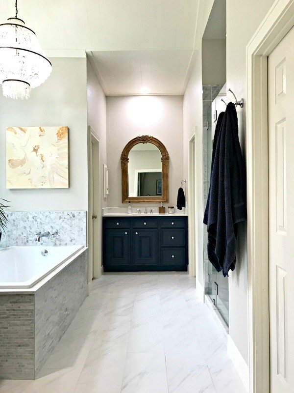
The DIY tutorials I have from this room include this DIY Shower Niche post, my 10 Beginner DIY Tips for Installing Floor Tile, and this post on Marble Mosaic Tile Bathroom Installation Tips.
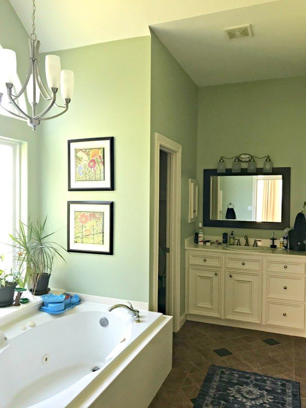
The old tub was dated and way too wide. So, I picked a tub that could be installed flush with the wall. But, that tub is super deep. It’s perfect for even big adults that love a soak.
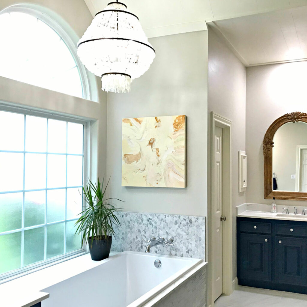
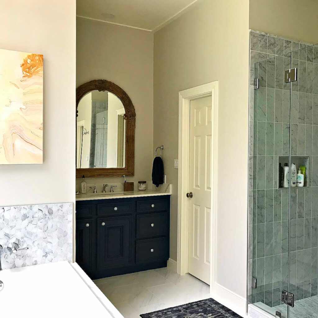
I also took the new shower tile and door a foot higher so it didn’t look so small in this vaulted bathroom.
Before And After Master Bedroom Makeover (21)
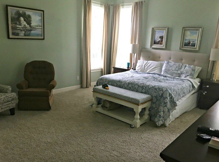
Moving on to the Master Bedroom, here’s the drab, boring version of this room. That green wall color just did nothing good in this lighting. So, guess what? Yep, we’re switching to a light wall color.
Let’s start with a look at the updates in 2019. It was a pretty good change, but still not quite right.
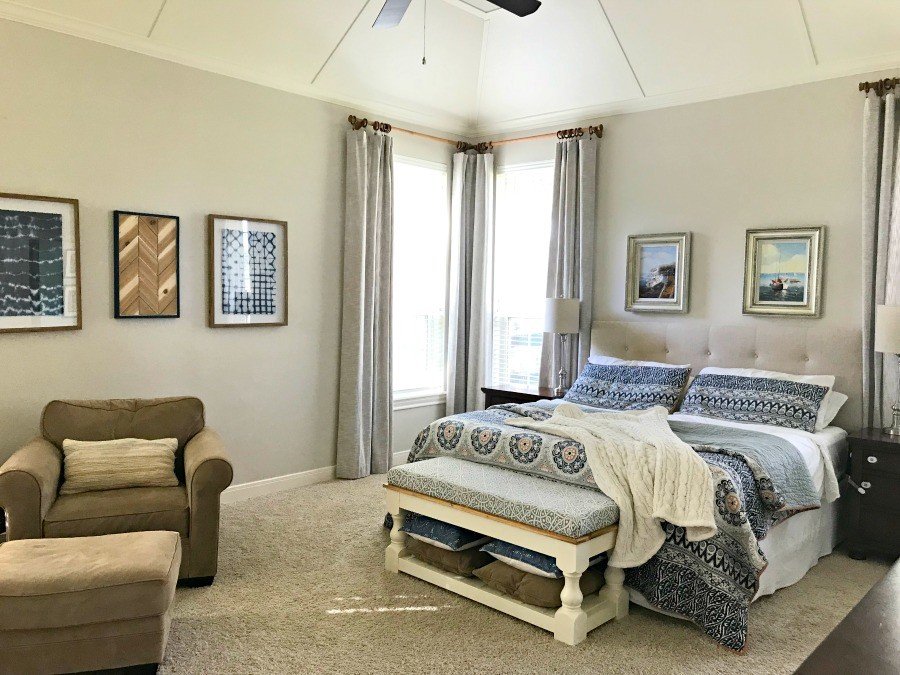
You can find the tutorials for the Easy DIY Chevron Wood Wall Art and the DIY Modern Farmhouse Bench I use as an end of bed bench, in previous posts.
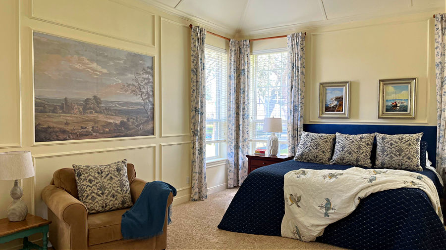
And, here’s how this room looks today. I added a DIY Vaulted Ceiling Paneling, DIY Picture Frame Trim on every wall, a DIY Framed Wall Mural, new curtains, changed the bedding, and switched out the chairs.
Porch Ceiling Makeover (22)
Now, let’s quickly move outside for our last 2 before and after room makeovers. Do these really count as rooms? Maybe the porch does, but the last one…not really. But, let’s do them anyway.
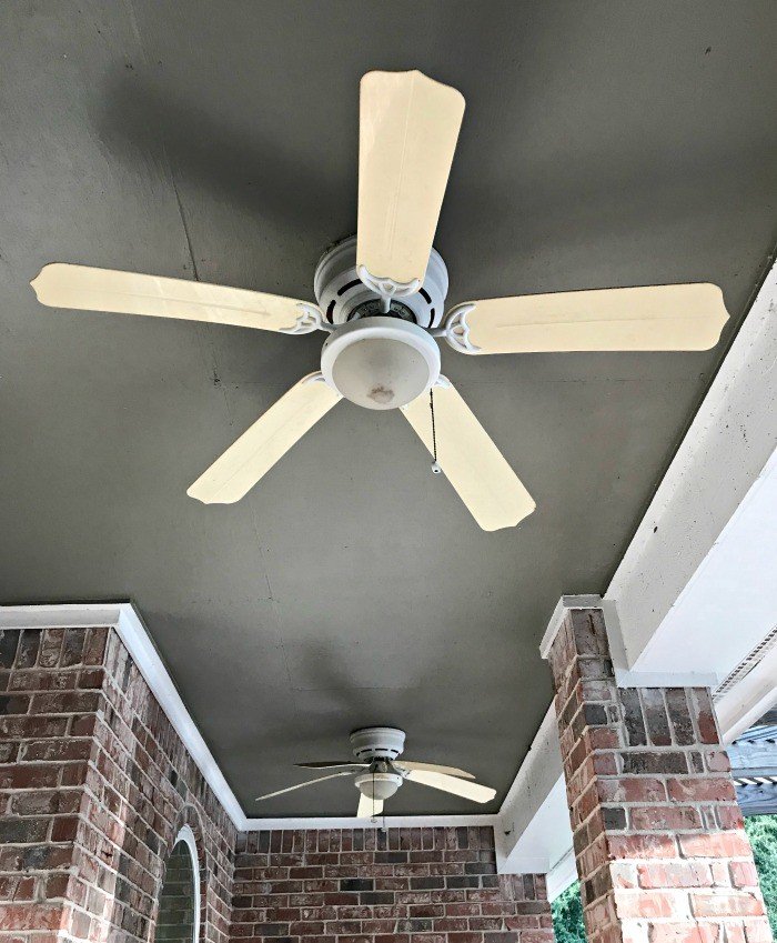
Here’s a look at our horrible porch ceiling. I hated how the edges of every piece of plywood on the ceiling were so obvious and cheap looking. So, I had to get my nail gun out to fix this one!
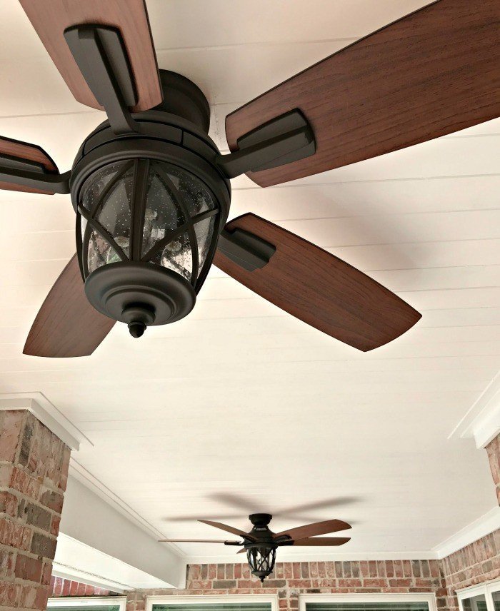
You can see the steps for the low-budget planks I installed in this DIY Tongue and Groove Porch Ceiling post. I LOVE these light, easy to use Pine planks.
Brick House Before And After Makeover (23)
And, last but not least, is my whole house, brick makeover. That’s right, I did the most controversial thing when it comes to brick, I painted it! Or rather, I paid someone else to paint it.
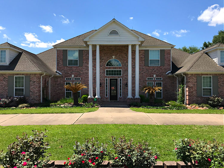
I wasn’t a fan of the way those 2-story high columns stood out as the “feature” on this house. Again, it had an 80’s/90’s vibe. Painting the house white helped the whole house work together.
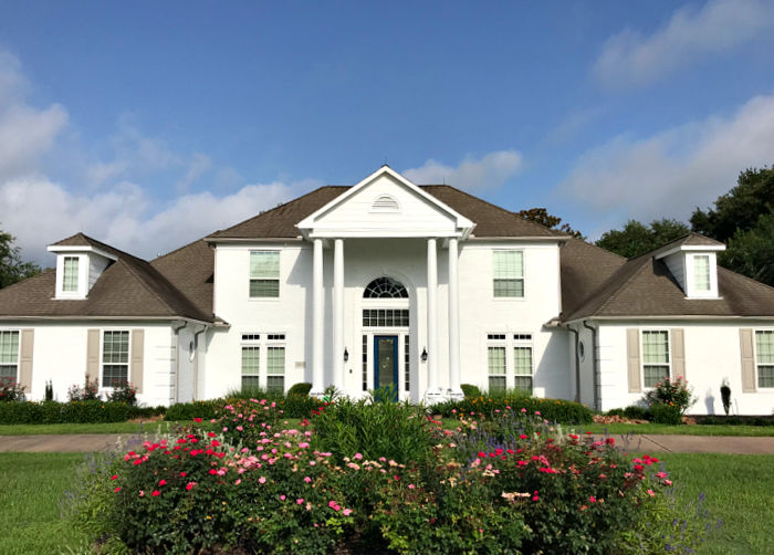
When I had the brick painted, I also bought and painted new vinyl shutters, changed up the landscaping, and I had the door painted blue.
That door had some issues with paint bubbling that stressed me out. But, we finally got that fixed. Check out How to Repaint a Door without Removing It if you need to paint your door.
That’s it for my big list of 23 before and after room makeover photos. Now, here’s a few more popular posts you might like.
- 24 Great Ways To Repurpose an Unused Dining Room
- 16 Great Ways to Repurpose an Open Formal Living Room
- 14 Best Ways to Renovate A Living Room on a Budget!
- 3 Easy Ways To Get The Sweat Smell Out Of Shirts And Gym Clothes
- How to Fix Water Stains on Ceiling Leaks: Super Easy Steps
- Testing 7 Easy Ways To Get A Heat Stain Out Of Wood
Some DIYs You Might Like
You might also like this post with 50 Yummy Ways To Make Smores At Home.

Here’s how to How Do I Get Rid of Cable And Still Watch TV: Easy Guide


Stephanie Abbott has been remodeling homes, updating & building furniture, and working on DIY home maintenance and cleaning tips for over 20 years. Her remodeling has been featured in Better Homes and Gardens Magazine. And, her DIY YouTube channel has had more than 8 million views.
Most of the DIY tutorials and videos on this site focus on beginner to intermediate level DIY Projects that can be done in an affordable way without high-end, expensive tools. All of the cleaning tips on this website have been tested in her home.
